
Visual Consistency in Branding: 2026 Complete Guide
Visual consistency in branding and digital design is essential for cultivating a recognizable identity and building trust with consumers. According to Lucidpress research, consistent branding can increase revenue by up to 23%, while studies show that color improves brand recognition by 80%. Furthermore, research indicates that 48% of consumers say a website’s design is the number one factor in determining a business’s credibility. By establishing emotional connections through effective color psychology and cohesive design elements, organizations create a visual language that resonates across every touchpoint. A consistent visual strategy reduces confusion, leading to a better user experience and promoting brand loyalty. Additionally, it differentiates a brand from its competitors, fostering long-term equity and consumer advocacy. By implementing thorough brand guidelines and maintaining uniformity across all platforms, companies can create an impactful presence that drives measurable business results.
Key Takeaways
- Visual consistency enhances brand identity, leading to immediate recognition and increased brand recall among consumers
- Cohesive visual strategies create emotional connections, significantly impacting consumer trust and loyalty
- A well-defined color palette and typography establish a recognizable brand voice that resonates with the target audience
- Consistent branding reduces confusion, improves user experience, and fosters long-term brand equity development
- Effective visual elements differentiate brands from competitors, enhancing overall marketing effectiveness and driving sales
The Foundation of Visual Consistency in Branding

Visual consistency serves as the backbone of effective branding, creating immediate recognition that transcends superficial elements. It is the practice of maintaining a uniform look and feel across every digital and physical touchpoint of a brand—from websites and mobile apps to social media profiles and printed materials. This uniformity is not merely an aesthetic choice but a strategic business imperative that ensures customers can identify a brand instantly, regardless of the platform.
By employing coherent visual strategies—particularly in logo design and the application of color psychology—brands can evoke specific emotional responses, consequently solidifying their identity in the minds of consumers. The human brain processes images significantly faster than text, and we are wired to recognize patterns. When those patterns remain consistent, they create cognitive ease, allowing users to navigate a website or app intuitively without having to relearn the interface on every page.
Color psychology plays a pivotal role in this process. Different colors elicit varied emotional reactions and associations. For instance, blue often conveys trust and reliability, making it a popular choice for financial institutions, while red can evoke excitement and urgency, frequently employed by brands targeting a younger demographic. When a brand consistently employs these colors across all platforms—using exact HEX or RGB codes—it reinforces its message and cultivates a specific emotional landscape that resonates with its target audience.
Moreover, a well-designed logo acts as a visual anchor for the brand. Consistent logo usage across marketing materials fosters familiarity and builds a sense of community among consumers. It signals professionalism and attention to detail, which are critical in establishing credibility. Research indicates that consumers are 3.5 times more likely to notice content with colored visuals than black-and-white content, underscoring the importance of a thoughtfully applied color strategy.
“Consistency is the foundation of trust. When customers see the same visual language across all touchpoints, they develop confidence in the brand’s reliability and professionalism.” — Brand Strategy Expert
The cumulative effect of visual consistency not only enhances a brand’s identity but also influences consumer perception and loyalty. When consumers encounter a brand that maintains visual coherence, they are more likely to associate it with stability, reliability, and quality. This trust translates into repeat business and advocacy, as satisfied customers become brand ambassadors. Hence, the strategic implementation of visual consistency—through thoughtful color choices and cohesive logo design—can significantly elevate a brand’s marketplace presence and consumer engagement.
Core Elements of Visual Identity
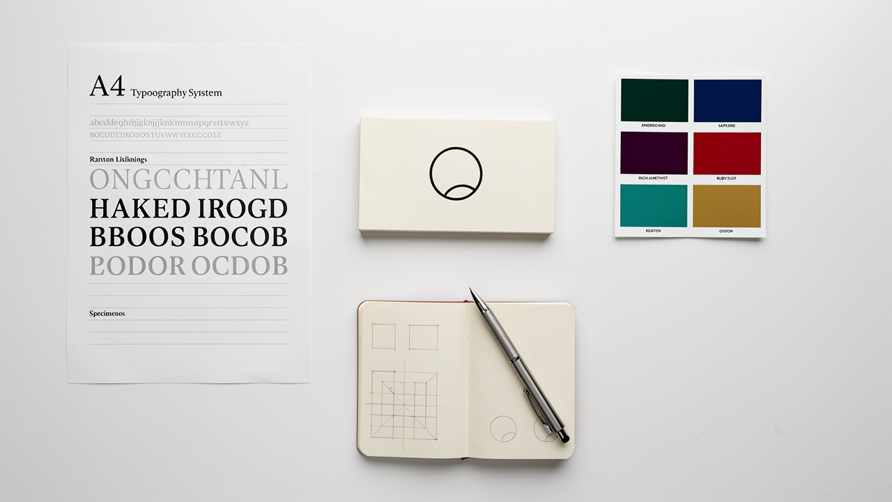
A robust visual identity comprises several key elements that work synergistically to convey a brand’s essence and message. Central to this identity is the color palette, which establishes the emotional tone and psychological impact of a brand. A thoughtfully selected range of colors not only enhances brand recognition but also influences consumer behavior, creating a lasting impression. The palette should serve a functional purpose, telling customers where to click (action colors) and what to prioritize.
Equally important is typography choice, which defines the brand’s voice and personality. The right fonts can evoke sophistication, creativity, or trust, and must align with the overall brand narrative. Font choices create a clear hierarchy—standardized H1, H2, and body text styles help readers instinctively understand the importance of information. Maintaining a limit of two to three specific fonts prevents visual clutter and ensures legibility across devices.
Complementing these elements, logo design serves as the cornerstone of visual identity, encapsulating the brand’s values and mission in a single, memorable symbol. A well-crafted logo must be:
- Simple enough to be remembered
- Versatile enough to function across various mediums without losing impact
- Distinctive enough to set the brand apart in a crowded marketplace
The imagery style further enriches a brand’s visual identity by setting the aesthetic that supports the overall message. Whether through photography, illustration, or graphics, imagery should consistently reflect the brand’s ethos and resonate with its target audience. This includes maintaining consistent filters, photo treatments, and lighting styles—for example, always using soft window light versus harsh studio lighting.
Layout and grids provide the structural foundation for visual consistency. Web designs should follow consistent spacing and structural rules. Whether on a blog or a product page, shared underlying structures help users feel oriented and reduce cognitive load. When a blog, a product page, and a checkout screen share the same grid patterns, the user experience feels seamless.
To maintain coherence across all visual elements, brand guidelines are essential. These detailed documents outline the proper use of the color palette, typography, logo, and imagery, ensuring that all stakeholders—internal teams, freelancers, and partners—adhere to a unified visual strategy. The guidelines should document not just what the rules are, but why they matter for the brand’s health.
Gestalt Psychology Principles in Visual Design
Understanding how the human brain perceives visual information is fundamental to creating effective visual consistency, particularly in UI/UX design and digital products — a connection reinforced by the New Brain Theory of imagination, which has begun reshaping how strategists approach design decisions. Gestalt psychology provides a scientific framework for understanding how people naturally organize visual elements into coherent patterns. Three key principles are especially relevant for maintaining visual consistency in interface design:
Law of Similarity states that elements that share visual characteristics—such as color, shape, size, or texture—are perceived as related or belonging to the same group. In interface design, this principle can be applied by:
- Using the same button style for all primary actions
- Applying the same icon treatment for all navigation elements
- Maintaining the same card design for all content blocks
When users see these similar elements, they instantly understand they serve related functions, reducing the learning curve and improving usability.
Law of Proximity suggests that objects placed close together are perceived as a group, while those farther apart are seen as separate. This principle is critical for creating intuitive layouts. For example, placing a label directly next to its corresponding input field signals their relationship, while adding white space between form sections helps users understand where one task ends and another begins. Consistent spacing rules—such as always using 16px between related elements and 48px between sections—create a predictable rhythm that guides the eye.
Law of Continuity indicates that the human eye naturally follows lines, curves, and paths. In digital design, this principle can be leveraged through consistent alignment of elements along invisible grid lines, creating visual “flows” that guide users through content. When navigation menus, content blocks, and call-to-action buttons align consistently across pages, users can scan and navigate more efficiently.
“Gestalt principles aren’t just theoretical concepts—they’re practical tools that, when applied consistently, create interfaces that feel intuitive because they align with how our brains naturally process visual information.” — UX Design Researcher
Applying these Gestalt principles consistently across a digital product creates an intuitive user experience where patterns become predictable. Users don’t need to consciously think about how to interact with an interface—they simply know, because the visual language remains constant. This psychological foundation is what transforms a collection of individual pages into a cohesive digital experience.
Design Systems and Component Libraries


Modern organizations maintain visual consistency at scale through design systems and component libraries—living frameworks that go far beyond static style guides. A design system is a comprehensive collection of reusable components, patterns, and guidelines that ensures every team member can build on-brand experiences without starting from scratch.
Component libraries serve as the building blocks of a design system. These are pre-built, tested UI elements—buttons, form fields, navigation menus, cards, modals—that can be assembled like LEGO blocks to create new pages and features. For example, if a marketing team needs to launch multiple landing pages, they can pull from a library of brand-approved hero sections and call-to-action buttons rather than designing each element individually. This approach ensures that visual consistency is “baked into” the workflow.
Design tokens represent another critical innovation in maintaining consistency. These are the atomic values—specific colors, font sizes, spacing units, border radius measurements—stored in a central repository and referenced throughout the design system. When a brand updates its primary blue from #0066CC to #0052A3, changing the design token automatically updates that color everywhere it appears across hundreds of pages and components. This eliminates the manual hunt-and-replace process that often leads to inconsistencies.
Leading design systems like Google’s Material Design, IBM’s Carbon, and Salesforce’s Lightning provide excellent models. They document not only what components look like but also:
- When to use them
- How they should behave
- Why certain design decisions were made
This documentation becomes institutional knowledge, ensuring consistency even as team members change.
For small to medium-sized businesses, implementing a full design system may seem overwhelming, though frameworks outlined in resources like How Web of Worlds helps SMEs build scalable open digital frameworks offer accessible starting points. However, starting small with a basic component library—standardized buttons, form elements, and typography styles—provides immediate benefits. Tools like Figma, Sketch, and Adobe XD offer built-in features for creating and sharing component libraries, making this approach accessible even to organizations without dedicated design teams.
The business value is clear: design systems reduce design and development time by up to 50%, decrease inconsistencies that erode brand trust, and enable teams to scale their digital presence without sacrificing quality. As organizations grow, the design system grows with them, serving as both a practical toolkit and a guardian of brand integrity.
Building Brand Recognition Through Visual Consistency
Effective brand recognition hinges on the strategic application of visual elements, with color psychology and logo design serving as foundational pillars. Studies show that it takes only 10 seconds for people to form a first impression of a brand’s logo, and consistent presentation of that logo across all channels increases its memorability exponentially.
Color psychology plays a significant role in how consumers perceive a brand. Different colors evoke specific emotions and associations, influencing consumer behavior and brand recall. For instance, blue often conveys trust and reliability, making it a popular choice for financial institutions, while red can evoke excitement and urgency, frequently employed by brands targeting a younger demographic. By carefully selecting a color palette that aligns with brand values, organizations can create an emotional connection that enhances recognition.
The power of color in brand recognition cannot be overstated. Research indicates that color improves brand recognition by 80%, making it one of the most critical elements of visual identity. When customers see a specific shade of red, they immediately think of Coca-Cola or Target. When they see a particular blue, they think of Facebook or IBM. This instant association is the result of years of consistent color application across every touchpoint.
Equally important is the design of the logo. A well-crafted logo serves as the visual cornerstone of a brand, encapsulating its essence in a single image. Simplicity is key; logos that are too complex can be difficult to remember. Additionally, logos must be versatile, functioning across various mediums—from billboards to mobile app icons—without losing impact. A strong logo should also be distinctive, setting the brand apart in a crowded marketplace.
Beyond color and logo, consistent typography creates a recognizable brand voice. When consumers see the same font family used across a website, social media posts, and email campaigns, it reinforces the brand’s identity. This typographic consistency acts as a subtle but powerful signal that all these touchpoints belong to the same organization, building familiarity and trust over time.
Real-World Examples of Visual Consistency Excellence
Examining how globally recognized brands maintain visual consistency provides valuable lessons for organizations of all sizes. These companies demonstrate that rigorous attention to visual detail translates directly into business success.
Coca-Cola
Coca-Cola has maintained one of the most recognizable visual identities for over a century. The brand’s signature red (Pantone 484C) appears consistently across every touchpoint—from vending machines in Tokyo to billboards in New York to social media posts worldwide. The distinctive Spencerian script logo, created in 1886, has remained largely unchanged, with only subtle refinements over the decades.
This unwavering consistency has made Coca-Cola the most recognized brand globally, with 94% of the world’s population able to identify its logo. The business impact is clear: Coca-Cola’s brand value is estimated at over $80 billion, with visual consistency playing a central role in maintaining that equity.
Apple
Apple exemplifies visual consistency in the technology sector. The company’s minimalist design philosophy—characterized by clean lines, generous white space, and a restrained color palette—remains consistent across product packaging, retail stores, websites, and marketing materials. Apple’s use of the San Francisco font family across all digital interfaces creates a cohesive experience whether a customer is using an iPhone, iPad, or Mac.
The company’s retail stores serve as physical manifestations of this consistency, with the same materials, lighting, and spatial design replicated globally. This meticulous attention to visual detail has helped Apple achieve a brand loyalty rate of over 90%, the highest in the technology industry.
Nike
Nike demonstrates how visual consistency can evolve while maintaining core identity. The iconic Swoosh logo, one of the most recognized symbols worldwide, appears consistently across all Nike products and marketing. However, Nike has mastered the art of adapting its visual language to different contexts—from high-performance athletic gear to lifestyle fashion—while maintaining brand coherence.
The company’s consistent use of bold typography, dynamic photography featuring athletes in motion, and a black-and-white color scheme (with strategic pops of color) creates instant recognition. Nike’s brand value exceeds $30 billion, with consistent visual branding contributing significantly to its position as the world’s leading athletic brand.
Starbucks
Starbucks provides an excellent example of visual consistency in the retail and hospitality sector. The brand’s signature green (Pantone 3425C), the Siren logo, and the distinctive store design create a consistent experience whether a customer visits a location in Seattle, Shanghai, or São Paulo. Starbucks extends this consistency to its mobile app, loyalty program, and seasonal marketing campaigns.
The company’s ability to maintain visual coherence while adapting to local markets has been key to its global expansion, with over 35,000 locations worldwide generating more than $30 billion in annual revenue.
“These brands demonstrate that visual consistency is not about rigidity—it’s about creating a flexible framework that maintains core identity while adapting to different contexts and evolving with the times.”
These examples demonstrate that visual consistency is not about rigidity—it’s about creating a flexible framework that maintains core identity while adapting to different contexts and evolving with the times. The business results speak for themselves: these brands command premium pricing, enjoy exceptional customer loyalty, and maintain market leadership in their respective categories.
Impact on Consumer Trust and User Experience

Visual consistency not only aids in building brand recognition but also plays a critical role in shaping consumer trust and improving user experience. In an increasingly competitive market, where consumers are inundated with choices, establishing visual trust through consistent branding elements is essential. When brands maintain uniformity in their visual identity—be it logos, color palettes, typography, or imagery—they create a cohesive narrative that resonates with consumers. This consistency fosters a sense of reliability; consumers are more likely to perceive a brand as credible, which directly influences their purchasing decisions.
The relationship between visual consistency and brand perception is intricately linked. Brands that exhibit visual inconsistency can confuse and alienate consumers, leading to skepticism and diminished trust. A disjointed visual experience may signal a lack of professionalism or attention to detail, prompting consumers to question the quality of the products or services offered. Research shows that 48% of consumers say that a website’s design is the number one factor in determining a business’s credibility. Conversely, when a brand presents a polished and consistent image, it signals stability and commitment, reinforcing positive associations in the minds of consumers.
Furthermore, the power of visual trust cannot be underestimated. Studies indicate that consumers are more inclined to engage with brands they visually recognize and trust, often leading to increased loyalty and repeat business. When customers encounter familiar visual patterns—the same button styles, consistent navigation placement, predictable content layouts—they can complete tasks more efficiently. This reduction in cognitive load directly improves the user experience, as customers don’t waste mental energy figuring out how each page works.
In the context of digital products and websites, visual consistency is particularly critical. Inconsistent design elements—such as:
- Shifting colors between a landing page and a checkout page
- A logo appearing in different sizes
- Navigation menus changing position across pages
- Buttons styled differently on various screens
These inconsistencies create subconscious friction that can lead users to abandon their tasks. Conversely, when design elements remain stable, users develop mental models of how the interface works, allowing them to navigate with confidence. This familiarity keeps them engaged and leads to higher conversion rates.
As brands navigate the complexities of consumer behavior, prioritizing visual consistency is necessary for cultivating enduring trust and fostering a loyal customer base. The strategic application of consistent visual elements transforms a collection of individual touchpoints into a unified brand experience that customers can rely on.
7-Step Framework for Implementing Visual Consistency
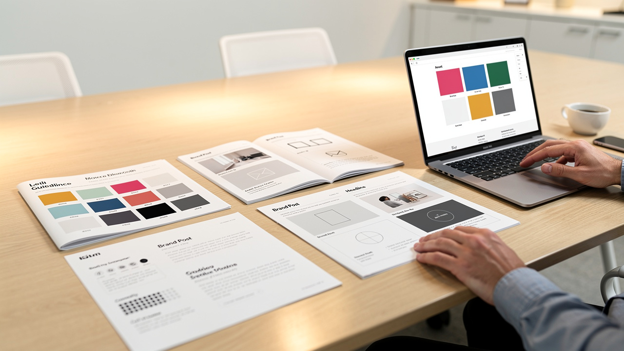
Implementing effective visual consistency requires a systematic approach that encompasses every aspect of a brand’s identity. Follow this comprehensive framework to establish and maintain visual coherence across all touchpoints:
1. Define Your Color Palette
Begin by selecting a primary color that embodies your brand’s core values and personality. Choose two to three secondary colors that complement the primary color and provide flexibility for different contexts. Specify exact color codes (HEX, RGB, and CMYK) for each color to ensure perfect reproduction across digital and print media. Document when to use each color—for example, primary color for main CTAs, secondary colors for accents and backgrounds. Include accessibility guidelines to ensure sufficient contrast ratios for readability.
2. Establish Typography Hierarchy
Select two to three font families that align with your brand personality—typically one for headings and one for body text. Define specific font weights, sizes, and line heights for each heading level (H1 through H6) and body text. Specify letter spacing, text alignment rules, and maximum line lengths for optimal readability. Create clear guidelines for when to use bold, italic, or other text treatments. Ensure all selected fonts are web-safe or properly licensed for digital and print use.
3. Build a Comprehensive Brand Style Guide
Create a centralized document that consolidates all visual standards. Include:
- Logo usage guidelines with clear spacing requirements, minimum sizes, and prohibited alterations
- Color palette documentation with usage examples
- Typography specimens showing all heading levels and text styles in context
- Guidelines for photography style, illustration treatments, iconography, and graphic elements
- Examples of correct and incorrect applications to prevent common mistakes
Make this guide easily accessible to all stakeholders through a shared digital platform.
4. Audit Existing Assets
Conduct a thorough review of all current brand materials—website pages, social media profiles, marketing collateral, email templates, and physical materials. Identify inconsistencies in logo usage, color applications, typography, and imagery style. Create a prioritized list of assets that need updating, focusing first on high-visibility touchpoints like the homepage, primary landing pages, and social media profiles. Document legacy issues to prevent them from being replicated in new materials.
5. Implement Design Tokens and Templates
Create reusable design components and templates that embody your brand standards. For digital products, establish design tokens—centralized variables for colors, spacing, typography, and other design attributes. Build component libraries in your design tools (Figma, Sketch, Adobe XD) containing standardized buttons, forms, cards, and navigation elements. Develop templates for common marketing needs—social media graphics, blog post headers, email layouts, presentation decks. Ensure these templates are easily accessible to all team members who create branded content.
6. Adopt Automation and Digital Asset Management Tools
Implement technology solutions to maintain consistency at scale — for teams using Apple ecosystems, updates like those covered in How macOS 27’s Siri AI and design tools change workflows for small teams are directly relevant to streamlining brand asset management. Consider:
- Digital asset management (DAM) systems to centralize approved brand assets and prevent the use of outdated materials
- Brand governance tools that can automatically scan websites for off-brand colors, unauthorized font usage, and incorrect logo applications
- Design systems that allow updates to propagate automatically—when you change a button style in the central library, it updates across all instances
For smaller organizations, even basic tools like shared Dropbox folders with organized templates can significantly improve consistency.
7. Schedule Regular Consistency Reviews
Establish a recurring audit process to catch visual drift before it becomes problematic. Conduct quarterly reviews of your primary digital touchpoints—website, social media, email campaigns—to ensure adherence to brand guidelines. Assign responsibility for brand stewardship to specific team members. When launching new products, campaigns, or entering new markets, conduct pre-launch brand reviews to verify consistency. Gather feedback from customers and team members about visual coherence. Update your brand guidelines as needed to address new use cases or platform requirements, but maintain the core visual identity that customers recognize.
“Visual consistency isn’t a one-time project—it’s an ongoing commitment that requires systematic processes, clear ownership, and regular review to maintain the brand integrity that customers trust.”
This systematic approach transforms visual consistency from an abstract goal into a practical, achievable outcome. By following these steps, organizations of all sizes can create and maintain a cohesive visual identity that builds recognition, trust, and long-term brand equity.
Frequently Asked Questions
How Does Visual Consistency Affect Social Media Marketing Strategies?
Visual consistency in social media marketing strategies significantly enhances brand recognition and audience engagement. A cohesive color palette and uniform design elements create a recognizable visual hierarchy, allowing brands to stand out in a saturated market. This consistency not only fosters trust but also amplifies marketing effectiveness, as consumers are more likely to connect with familiar visuals. A well-defined visual strategy can lead to stronger brand loyalty and improved campaign performance.
Can Visual Inconsistency Damage a Brand’s Reputation?
Visual inconsistency can significantly damage a brand’s reputation by undermining brand perception and diluting its visual identity. When elements such as logos, colors, and typography vary across platforms, it creates confusion among consumers, leading to mistrust. A cohesive visual identity is essential for fostering recognition and loyalty; any deviation can signal unprofessionalism or lack of attention to detail. Therefore, brands must prioritize visual consistency to maintain their integrity and strengthen their market position.
What Are Common Mistakes in Visual Branding?
In the field of visual branding, common pitfalls can undermine a brand’s effectiveness. Missteps often include inconsistent color palettes, excessive logo variations, and haphazard typography choices. Additionally, neglecting a cohesive imagery style and failing to adhere to established brand guidelines can disrupt visual hierarchy, confusing the audience. Mastering these elements is essential for creating a compelling and recognizable brand identity.
How Does Visual Consistency Influence Employee Perception of the Brand?
Visual consistency profoundly influences employee perception of the brand by fostering a sense of belonging and alignment with corporate values. When employees encounter cohesive branding, it enhances their engagement and reinforces brand loyalty. This alignment not only nurtures a positive workplace culture but also encourages employees to act as brand ambassadors. Consequently, a visually consistent brand creates a unified identity that empowers employees, leading to increased motivation and productivity within the organization.
Are There Industries That Benefit More From Visual Consistency?
Studies indicate that consistent branding can increase revenue by up to 23%. Industries such as fashion and automotive design benefit significantly from visual consistency, fostering brand loyalty through aesthetic appeal. In the tech sector and healthcare marketing, cohesive visuals enhance user experience and trust. Food branding and hospitality aesthetics rely on visual uniformity to evoke desired emotions, while education branding and retail experience utilize it for compelling narratives, driving consumer engagement and satisfaction.
Conclusion
Visual consistency represents far more than an aesthetic preference—it is a strategic business asset that drives recognition, builds trust, and creates seamless user experiences across all touchpoints. From the psychological foundations of Gestalt principles to the practical implementation of design systems, maintaining visual coherence requires both strategic thinking and systematic execution. The seven-step framework outlined here provides a roadmap for organizations of all sizes to establish and maintain visual consistency, while real-world examples from global brands demonstrate the tangible business impact of this commitment.
By treating visual consistency as an ongoing practice rather than a one-time project, businesses can create a recognizable identity that resonates with consumers, differentiates them from competitors, and builds long-term brand equity. In an increasingly crowded marketplace, the brands that succeed are those that present a unified, professional, and trustworthy face to the world—and visual consistency is the foundation upon which that success is built.